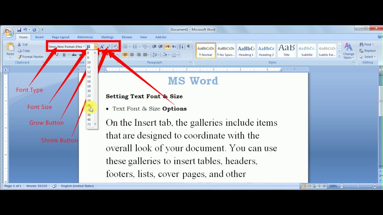
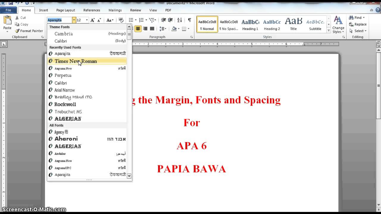
Have you ever landed on a website and instantly felt overwhelmed by a wall of tiny, illegible text, or perhaps assaulted by overly large, shouty headlines? The way text is presented has a profound impact on user experience, and at the heart of this lies font size. Controlling font size effectively is crucial for creating content that is not only visually appealing but also easily digestible.
Font sizing, in its simplest form, refers to the height of characters displayed on a screen or in print. However, it's more than just picking a number. It's about creating a visual hierarchy, guiding the reader's eye, and ensuring that your message is communicated effectively. Getting it right can elevate your design, while getting it wrong can make your content inaccessible and frustrating.
From ancient scribes meticulously crafting letterforms to the digital age of pixel-perfect typography, the principle of appropriate sizing has always been paramount. Historically, font size was determined by physical limitations of the tools used, like the width of a calligraphy nib or the size of a printing press's type. In the digital realm, we have unprecedented control, but that also brings new challenges.
One of the primary concerns today is ensuring readability across different devices and screen sizes. With the proliferation of smartphones, tablets, and desktops, achieving consistent font sizes and a harmonious reading experience requires careful planning and execution. This often involves using relative units like ems and rems, which allow text to scale proportionally to the user's screen settings.
Another key aspect of font sizing is its role in establishing visual hierarchy. Larger fonts draw attention and signal importance, while smaller fonts are used for body text and less prominent elements. This contrast helps readers quickly scan and understand the content's structure, leading to improved engagement and comprehension.
Understanding how to specify font size is fundamental. In web design, Cascading Style Sheets (CSS) provide properties like `font-size`, which can be set using various units such as pixels (px), points (pt), ems (em), rems (rem), percentages (%), and keywords (e.g., small, medium, large). Each unit has its advantages and disadvantages, and selecting the right one depends on the specific context.
One benefit of using relative units like ems and rems is their responsiveness. They adapt to the user's browser settings and device, ensuring consistent readability across various platforms. Pixels, on the other hand, offer precise control but can lead to accessibility issues if users adjust their default font sizes.
A well-structured typography system contributes to a positive user experience. By carefully selecting font sizes that are both visually appealing and easy to read, you enhance the overall usability of your content. This can lead to increased user engagement and satisfaction.
Effective font size management also improves accessibility. By using relative units and providing options for users to adjust font sizes, you ensure that your content is accessible to individuals with visual impairments or other disabilities.
Advantages and Disadvantages of Different Font Size Units
| Unit | Advantages | Disadvantages |
|---|---|---|
| px | Precise control | Not responsive, accessibility issues |
| em/rem | Responsive, accessibility friendly | Can be complex to manage |
Best Practices:
1. Use relative units (ems, rems) for responsive design.
2. Establish a clear visual hierarchy using different font sizes.
3. Test your design on different devices and screen sizes.
4. Consider accessibility guidelines (WCAG).
5. Prioritize readability and user experience.
Frequently Asked Questions:
1. What is the best font size for body text? A general guideline is 16px or 1rem.
2. What is the difference between em and rem? Ems are relative to the parent element, while rems are relative to the root font size.
3. How can I make my website more accessible for users with visual impairments? Use relative units and provide options for users to adjust font size.
4. What are some common font sizing mistakes to avoid? Using fixed pixel sizes, inconsistent sizing, and neglecting mobile responsiveness.
5. What are some good resources for learning more about typography? Books like "Thinking with Type" and websites like A List Apart are excellent resources.
6. How does font size impact SEO? While not a direct ranking factor, good readability improves user experience, which can indirectly affect SEO.
7. What's the best way to test font sizes on different devices? Use browser developer tools and test on real devices.
8. Are there any tools that can help me manage font sizes in my designs? Yes, design software like Figma and Sketch offer robust typography control.
Tips and Tricks:
Use a modular scale to create harmonious font size ratios.
In conclusion, mastering font size is an essential skill for anyone involved in content creation, whether for web or print. By understanding the principles of typography, the nuances of different sizing units, and the importance of accessibility, you can create content that is not only visually appealing but also highly effective in communicating your message. Implementing best practices and regularly testing your design across various platforms are key to ensuring a positive user experience. This ensures that your message reaches its intended audience clearly and effectively, ultimately contributing to the success of your communication goals. So, take the time to refine your font size strategies – your readers will thank you for it.
A taste of ocala exploring sams st johns seafood
Gabes clan name generator find the perfect fit
Level up your online presence minecraft full body pixel art profile pictures
Best Font Style In Resume at Josephine Caldwell blog - You're The Only One I've Told
APA Format Font Size Spacing Explained - You're The Only One I've Told
PowerPoint How to Format Font Size - You're The Only One I've Told
Best font for a dissertation - You're The Only One I've Told
Whats the Best Resume Font Size and Format 2023 - You're The Only One I've Told
10 Skills for Cover Letters - You're The Only One I've Told
format for font size - You're The Only One I've Told
Format For Font Size - You're The Only One I've Told
What Size Font Is Mla - You're The Only One I've Told
format for font size - You're The Only One I've Told
APA Style and Format - You're The Only One I've Told
Business Letter Format Font Size - You're The Only One I've Told
Is arial font acceptable in apa format - You're The Only One I've Told
Enlightium Academys MLA Format Enlightium Academy Support - You're The Only One I've Told
Format For Font Size - You're The Only One I've Told


