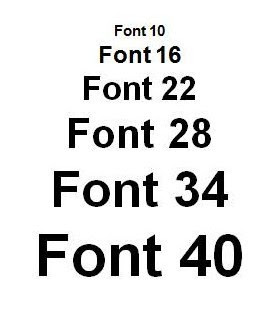
Ever squinted at an email, wondering if it was written in ant-sized script or if your vision was suddenly failing? The struggle is real, people. Choosing the correct font size for your emails isn't just about aesthetics, it's about accessibility, readability, and ultimately, getting your message across.
Think of your email inbox as a crowded marketplace. You're vying for attention amongst a sea of competitors. If your message is difficult to decipher, chances are it'll get lost in the shuffle, unread and unloved. But fear not, email typography doesn't have to be a cryptic puzzle. With a few simple guidelines, you can master the art of optimal email font sizes.
The ideal email font size walks a delicate tightrope between readability and visual appeal. Too small, and your readers will strain their eyes (and their patience). Too large, and your message can feel shouty and unprofessional. So, what's the Goldilocks size – just right? Generally, a font size between 14px and 16px is considered the sweet spot for most email clients and devices.
But it's not just about the numbers. Font choice plays a crucial role too. Web-safe fonts like Arial, Helvetica, Times New Roman, and Verdana are your best bet for ensuring consistent rendering across different email platforms. Fancy, decorative fonts might look cool on your screen, but they could show up as gibberish on your recipient's end. Stick to the classics for maximum compatibility.
Historically, email was primarily text-based, and font size wasn't as crucial. As email evolved and HTML became more prevalent, the importance of appropriate font sizing grew. Early email clients had limited font support, and inconsistent rendering across different platforms became a major issue. Today, with the proliferation of mobile devices, optimizing email font size for various screen sizes is more critical than ever.
Three key benefits of choosing the correct email font size are increased readability, improved user experience, and enhanced brand professionalism. Readable emails are less likely to be ignored or misunderstood. A positive user experience encourages engagement with your message and your brand. Professional-looking emails build trust and credibility.
Your action plan for optimal email font sizes: choose a web-safe font, aim for 14-16px body text, and test your emails on various devices and email clients. For headings, slightly larger sizes, around 18-22px, are appropriate. Remember, consistency is key. Maintaining the same font size throughout your email promotes a clean and organized look.
Advantages and Disadvantages of Correct Font Size
| Advantages | Disadvantages |
|---|---|
| Improved readability | Difficult to achieve consistency across all email clients |
| Enhanced user experience | Requires testing on different devices |
| Increased engagement | Can affect email layout if not implemented carefully |
Best Practices: 1. Use web-safe fonts. 2. Aim for 14-16px for body text. 3. Test on different devices. 4. Maintain consistency. 5. Consider mobile responsiveness.
Challenges and Solutions: 1. Inconsistent rendering across email clients – Solution: Use web-safe fonts. 2. Difficulty reading on small screens – Solution: Optimize for mobile. 3. Emails appearing too large or too small – Solution: Test and adjust accordingly.
FAQs: 1. What is the best font size for email? A: 14-16px. 2. What are web-safe fonts? A: Fonts consistently displayed across different email clients. 3. Why is email font size important? A: For readability and user experience.
Tips & Tricks: Preview your emails before sending. Use a consistent font size throughout your message. Consider using a slightly larger font size for headings.
In conclusion, choosing the correct font size for your emails is a small detail with a big impact. It's the difference between a message that gets read and one that gets deleted. By following these guidelines, you can ensure your emails are accessible, engaging, and effectively communicate your message. Remember, email is a powerful tool for connecting with your audience. By prioritizing readability and user experience, you can maximize the impact of your emails and build stronger relationships with your readers. Don't underestimate the power of good typography – it can make or break your message. So, ditch the microscopic font and embrace the power of legible, well-designed emails. Start optimizing your email font sizes today and watch your engagement soar.
Unlocking creativity the power of lilo stitch printables imagen de lilo y stitch para imprimir
The subtle charm of lemon chiffon a sherwin williams classic
Experience the magic of nora en pure live
correct font size for email - You're The Only One I've Told
Spark mail mac font size - You're The Only One I've Told
correct font size for email - You're The Only One I've Told
Best Font For Resume In Canva at Marie Le blog - You're The Only One I've Told
Resume Tip Your First Route To Secure The Dream Job - You're The Only One I've Told
correct font size for email - You're The Only One I've Told
All About Presentations by Jazz Factory What is the ideal font size - You're The Only One I've Told
Best Font For Resume 2024 Reddit - You're The Only One I've Told
How to check correct font size - You're The Only One I've Told
correct font size for email - You're The Only One I've Told
Format For Font Size - You're The Only One I've Told
Business Letter Format Spacing - You're The Only One I've Told
What is the Best Resume Font Size and Format Best Fonts to use for - You're The Only One I've Told
3 in x 3 in Fitting Pipe Size Schedule 80 45 Elbow - You're The Only One I've Told
Best Font Style In Resume at Josephine Caldwell blog - You're The Only One I've Told


